Forms
Uses of forms
The "Forms" skill allows you to build a form script mixing texts and questions, in order to collect data for downstream processing after the conversation with the digital assistant (e.g.: user data collection, training session, satisfaction questionnaire, etc.).
A form:
-
can be started by the digital assistant as soon as the conversation begins, without going through the standard welcome screen.
-
or be launched via a user question:
- either pre-positioned in the welcome screen via frequently asked questions,
- or on a specific user question.
For this second option, a list of training phrases must be associated with the form for the digital assistant's learning.
Display and data input components
To compose a form, several types of components are available, including media cards. These allow you to better guide the user in entering the expected data and to better control the value entered. They also allow you to mix card types to make this type of dialogue — which often requires several minutes of attention — less monotonous.
Regardless of the card model used, the validation of the response to the question is done by the user's action on the "Validate" button.
"Single-choice selection" cards
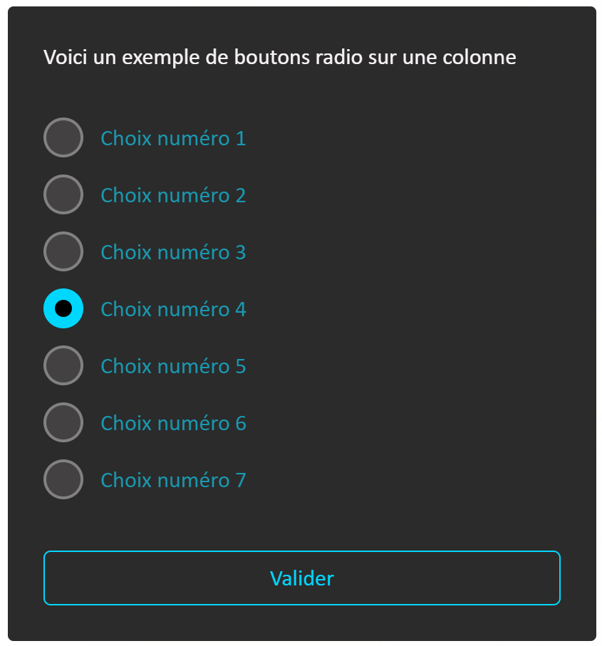
Card A - Radio buttons
Single choice is commonly presented as a list of radio buttons.
When you have more than 5 possible choices, or very short texts (one or 2 words), we recommend formatting the list in 2 columns, to limit the height of the card and avoid user scrolling, particularly in widget mode (conversation window limited in height and width).

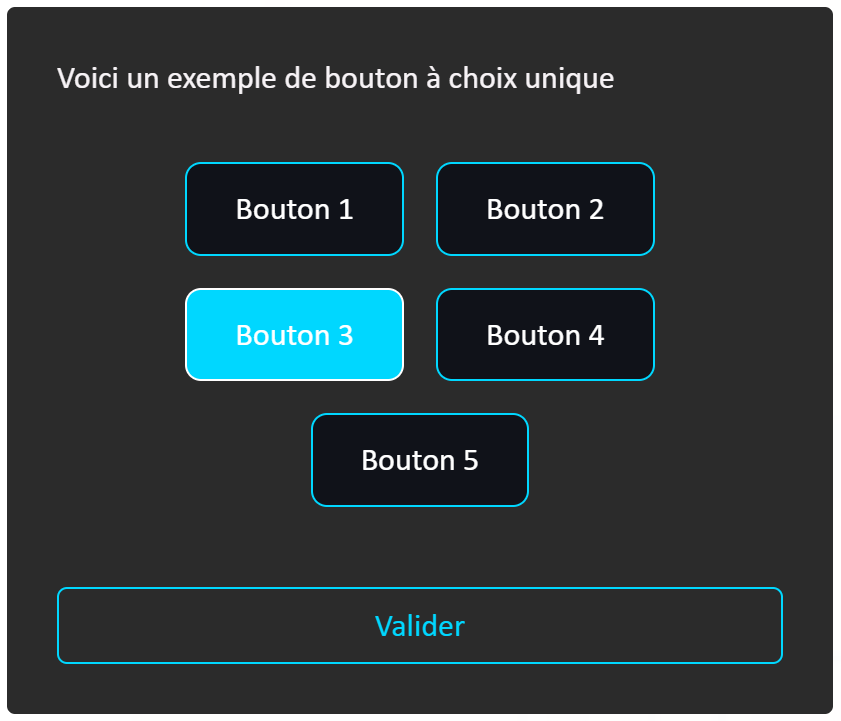
Card B - Buttons
You can also present your single-choice list as buttons.
This card is used particularly when there are 5 or fewer choices and the text is short.
"Multiple-choice selection" cards
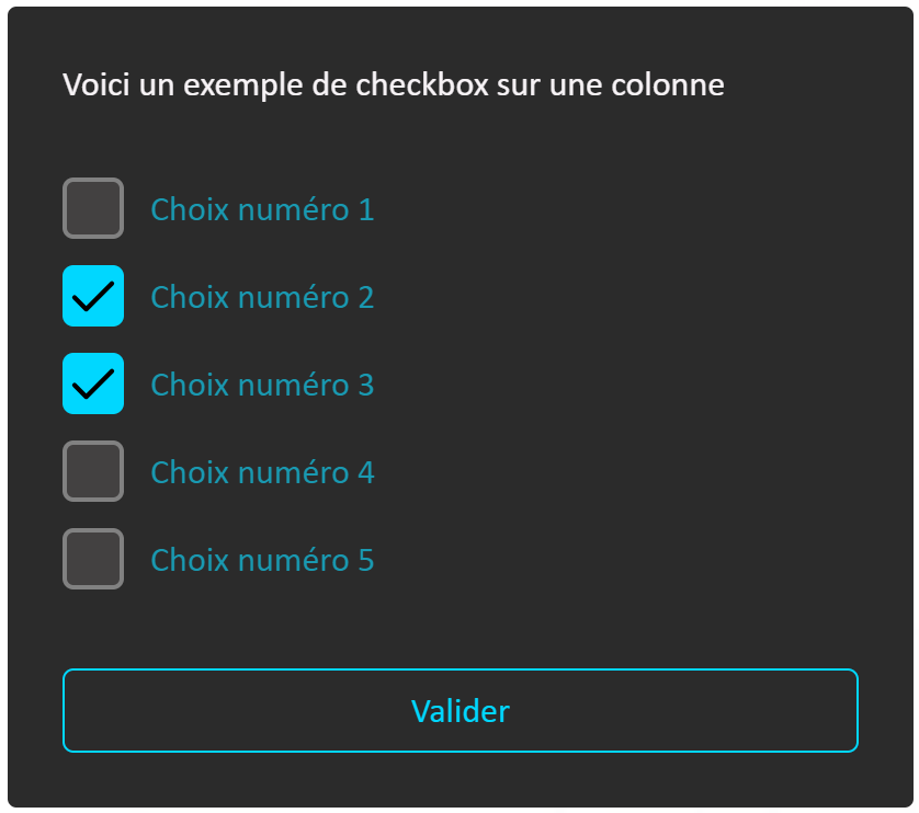
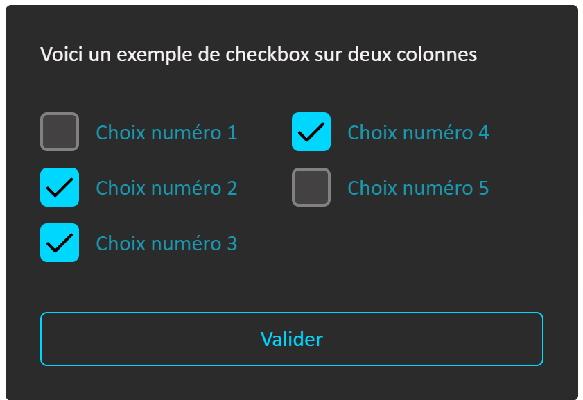
Card A - Checkboxes
Multiple choice is commonly presented as a list of checkboxes.
When you have more than 5 possible choices, or very short texts (one or 2 words), we recommend formatting the list in 2 columns, to limit the height of the card and avoid user scrolling, particularly in widget mode (conversation window limited in height/width as an overlay on a website).
Card B - Buttons
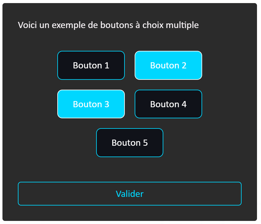
You can also present your multiple-choice list as buttons using this card.
It is used particularly when there are 5 or fewer choices and the text is short.
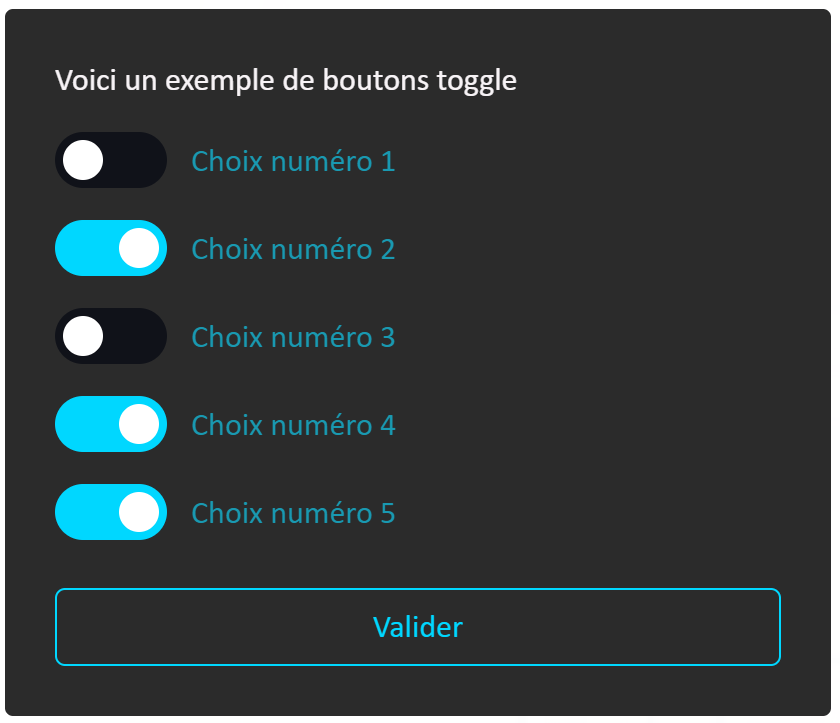
Card C - Toggle Switch
This card is used for multiple choice and more particularly for an activation concept.
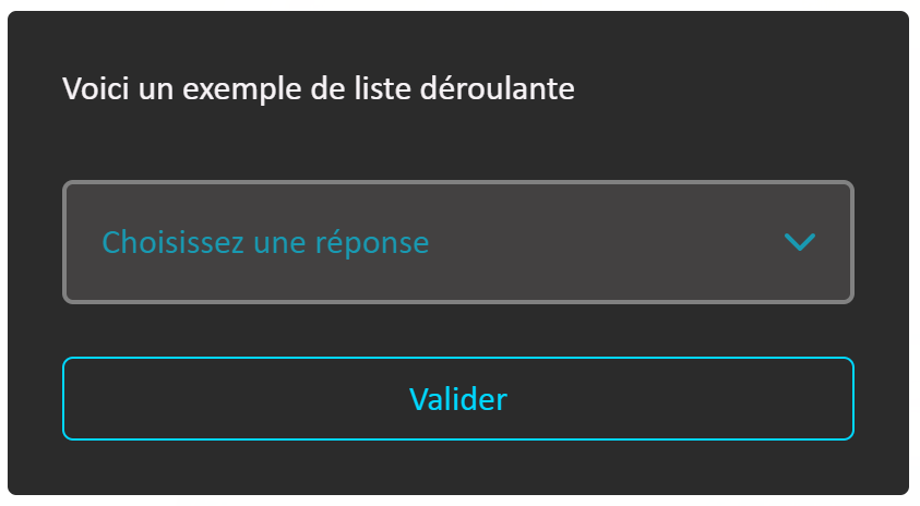
"Drop-down list selection" card
The drop-down list is used for a single choice and more particularly when there are more than 5 options and their text is long. It also saves vertical space when needed.
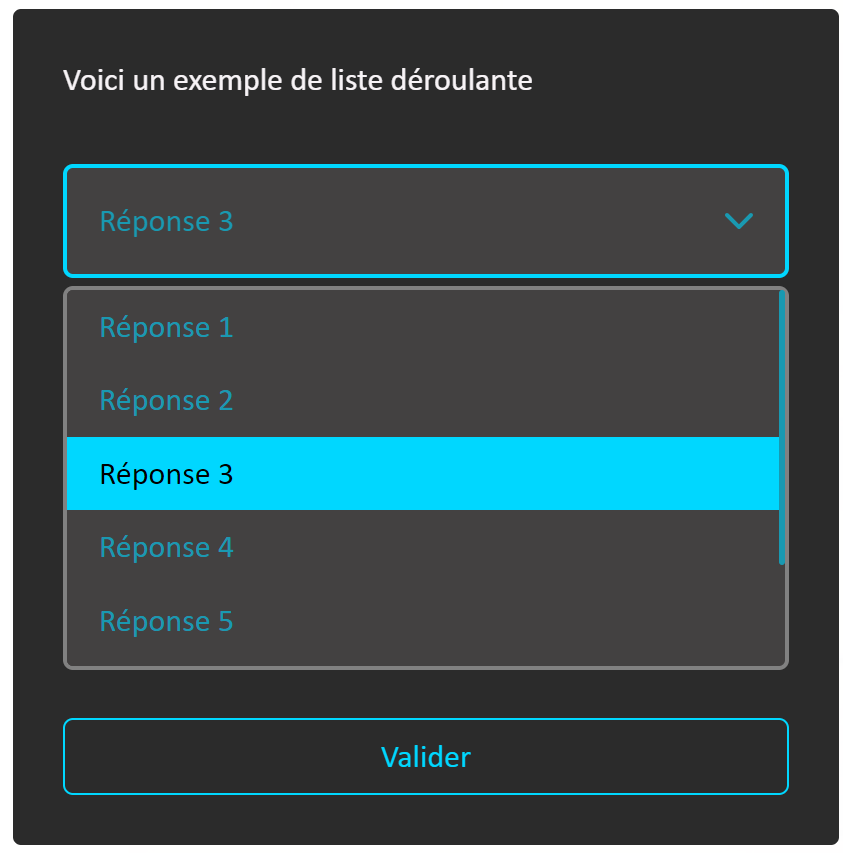
"Image selection" cards
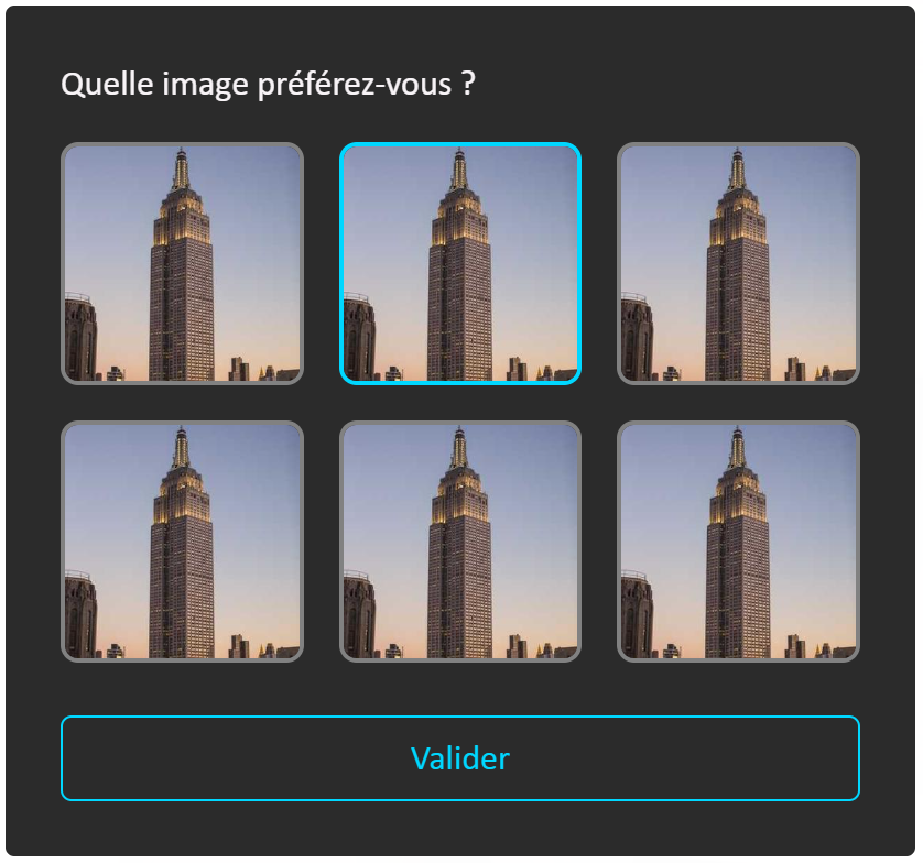
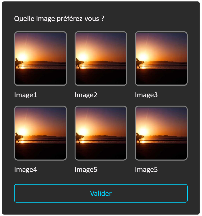
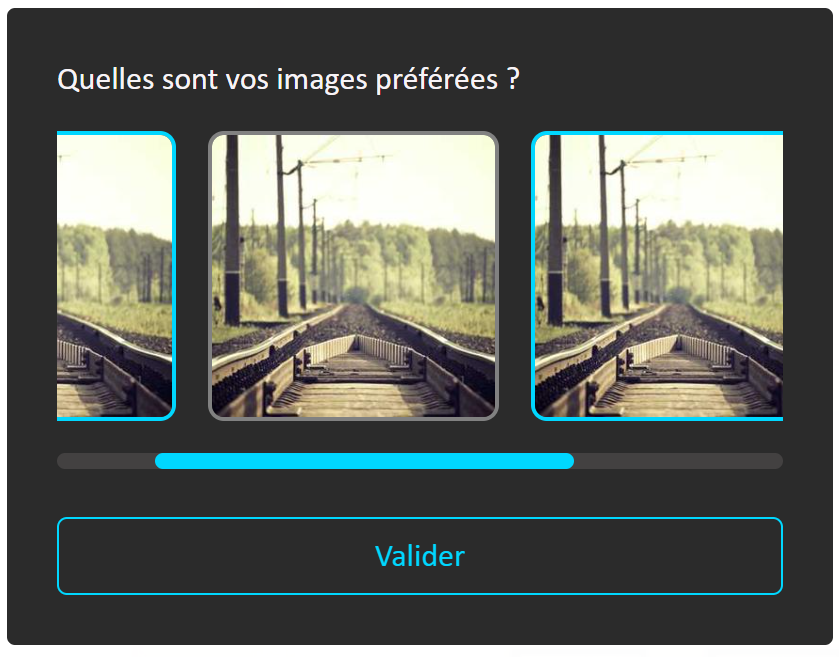
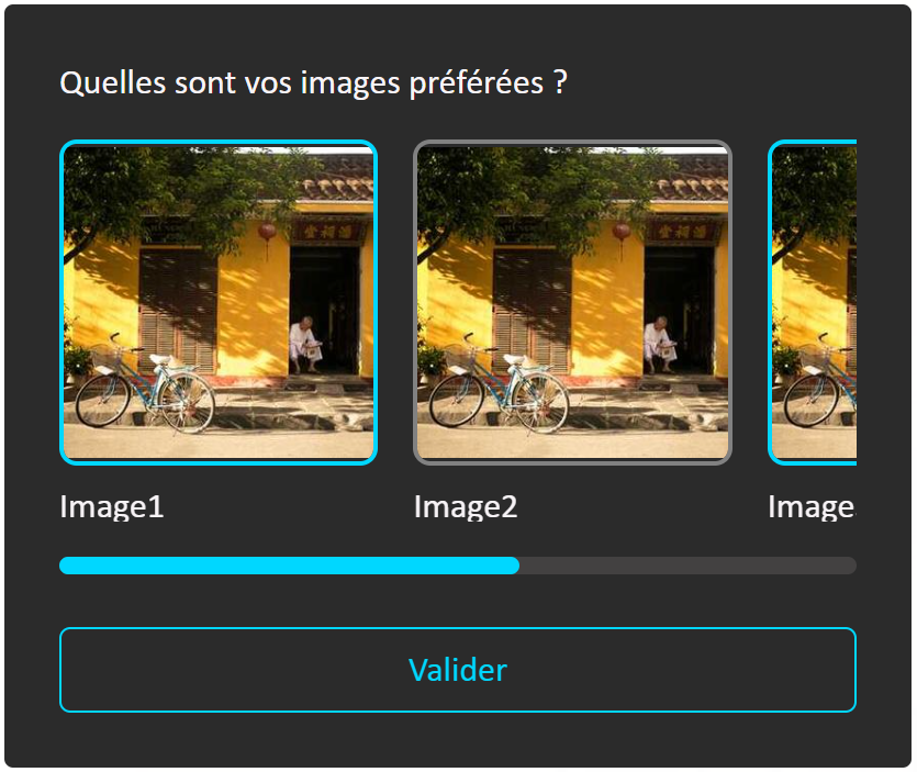
All image card types can be used to display a series of images with single selection or multiple selection.
Card A - All images visible
This card is used to display up to 6 thumbnails maximum.
It is possible to apply a short caption to images: the text must not exceed 2 lines. If the text is longer, the punctuation "..." is displayed.
Card B - Horizontal scroll
This card is used when there are more than 6 images.
It is possible to apply a short caption to images: the text must not exceed 2 lines. If the text is longer, the punctuation "..." is displayed.
"Date or time selection" card
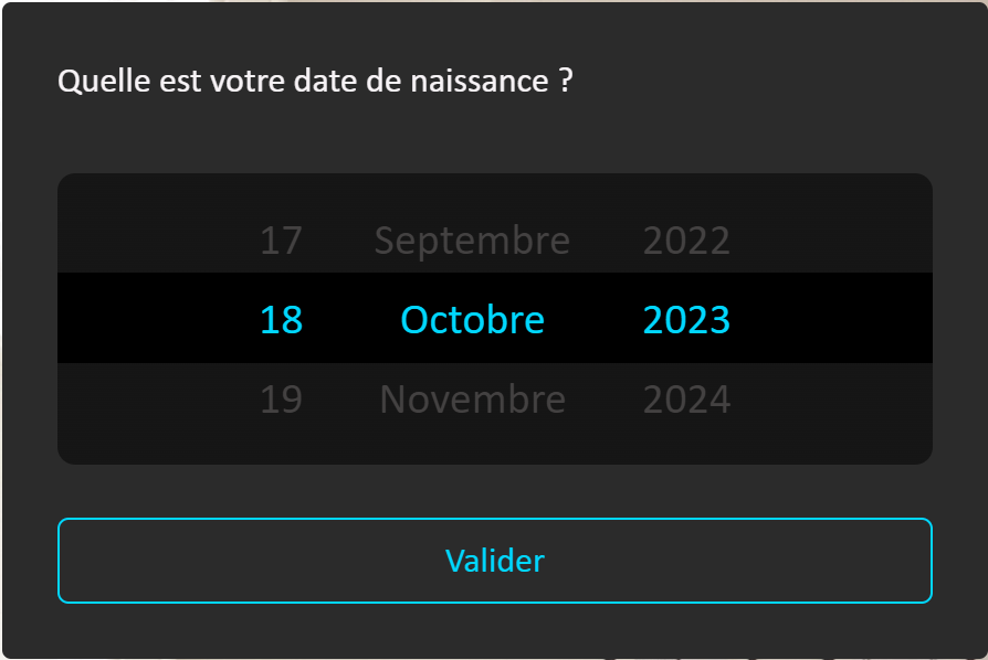
Card A - Date
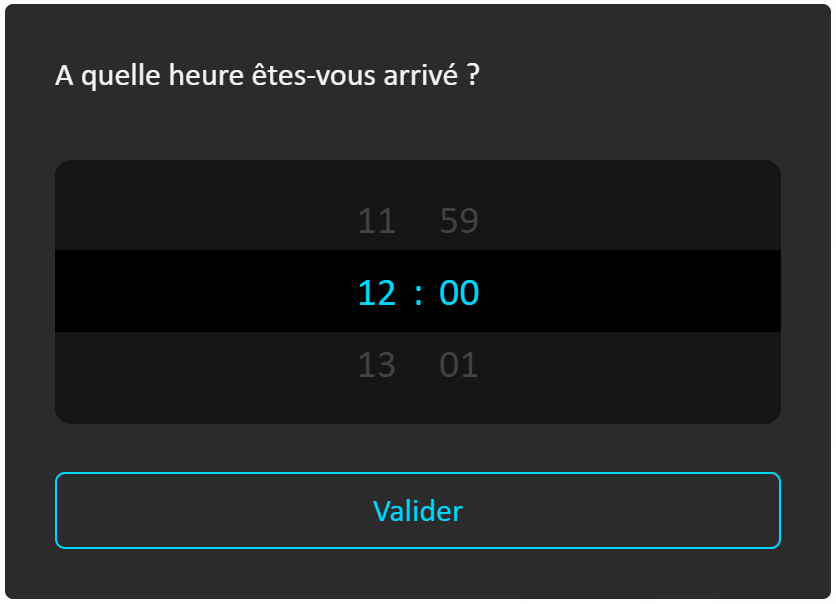
Card B - Time
Card C - Calendar
not currently available
Recommendations:
- Cards A and C are used to choose a date.
- Card A is used more particularly to select a date that is "known" to us without an important notion of the day of the week (e.g. a date of birth).
- Card C is used more particularly to have a global view of the month with notably the notion of day of the week (e.g. to book an appointment date).
- Card B is a variant of Card A for a time slot selection. Their operation is identical.
- To choose a period, use 2 cards: one Card A or B for the start date or time and another for the end date or time.
"Measurement scale" cards
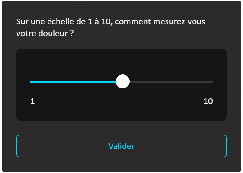
Card A - Slider
Card A can be used to measure a value between two states (e.g.: from "0" to "10", from "full of energy" to "tired", etc.)
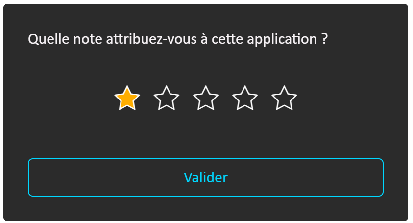
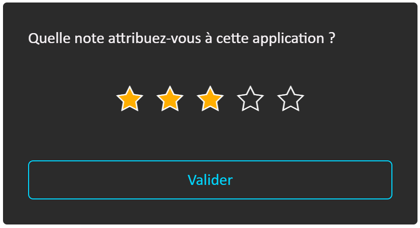
Card B - Likert scale
For user satisfaction, the use of Card B is recommended. The user clicks on the number of stars corresponding to their rating between 1 and 5:
Displaying an information message
Beyond media cards containing the question and proposed answers, you may also need to display text messages to the user, either at the beginning of the form, between 2 cards, or at the end of the form.
Example of a message at the beginning of a form:
- In "Text Mode", this message is displayed to the user in the conversation window like any response the digital assistant would give to a knowledge base question:

- In "Voice mode", this message is dictated aloud by the digital assistant and visible in real time as subtitles at the bottom of the screen, on the character's side, if subtitling is enabled:

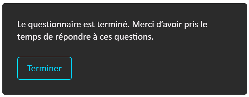
Another example of a message at the end of a form with an action button that needs to trigger a process external to this conversation with the digital assistant:
- This message is presented as a card with an action button aligned to the left:
Alphanumeric or numeric value input
Form structure
Retorik Studio allows you to create one or more forms according to your needs. Creating multiple forms allows you to shorten the script and improve code readability.
Indeed, a form script is written in JSON code with a specific structure to respect.
Place your code in the editor named "Form elements JSON". It must respect the structure below:
[ // Form start*

  { // Section start*
      "$type": "K2.Bot.Forms.Models.Section, K2.Bot.Forms"
      // Section start properties
      "Items": [ // Describe the various display or data input components below
       {
         // JSON code for component 1
         // Each component must have an identifier and designate the component from:
           "Identifier": "unique number",
           "NextItemIdentifier": "unique number",
       }
       {
          //JSON code for component 2
       }
       {
         // JSON code for component n
       }
    ],
    // Section end properties including:
      "Identifier": "1", //Section identifier

  } // Section end

] // Form end
Notes:
- The section or component identifier can take the form of "0.001" or "1.0003": it is better to assign numbers in blocks (every 10, for example) rather than 1 by 1, making it easier to insert elements without renumbering your components.
- A section or component can be processed conditionally via the property:
- "Condition": "expression",
- "Condition": "expression",
- A form can contain one or more sections.
- A form can call another form. Place the form call in the editor named "JSON of the element to send at the end of the form".
Refer to the Developer documentation for detailed code for a section and components.
Enabling the feature
To enable the "Forms" feature, go to the "Configuration > Features" menu and enable the following modules:
K2.Bot.Forms
K2.Bot.Forms.API
Recommended technical support
Building a script is fairly technical.
This feature is described in general terms in this section.
However, DAVI recommends additional support for your teams when setting up forms and retrieving data for your processing external to the RETORIK platform.
Contact DAVI for an assessment of your needs.